Project Overview
At the end of 2023, Kytary.cz launched their redesigned website. While the new design looked visually appealing, there were still many gaps that needed to be addressed and problems that required solution.
As the Lead UX Designer, I oversaw the entire design process, collaborating closely with the Product Manager, Graphic Designers, UX Writers, Developers, and Data Analyst, bridging the gap between product and business.
User Insights
The idea for cart optimization came to me after analyzing data from heatmaps and funnels using tools like Smartlook and Google Analytics.
This data revealed that 70% of users were dropping off already at the first step in the cart.
So, I decided to investigate further by analyzing user behavior during the purchase process, as well as reviewing data from the initial testing sessions.
During the testing session, multiple issues were identified:
- Overall Orientation in the Purchasing Process: Respondents were often confused about their current step in the process.
- Button Visibility: Respondents frequently overlooked important buttons.
- Cluttered Layout: The interface appeared overly crowded, making it difficult for respondents to focus on essential elements.
- Irrelevant Cross-Selling Offers: Many respondents criticized the irrelevance of the cross-selling content.
The expected user journey during checkout would look something like this:

But in many cases, it looked like this:

Certain user behavior will be explained shortly...
These frictions for users revealed an opportunity for me to improve the checkout experience while also supporting the primary business objectives of improving the user experience during the purchase journey and increasing conversion rates
Project Goals
To establish the project goal based on user insights and discoveries, I used the SMART framework to define the project's objectives:
Specific: Optimize the checkout process and redesign the cart's first step to enhance clarity, improve feedback on item additions and ensure visibility of "Proceed to Checkout" button.
Measurable: Achieve a 20% reduction in the drop-off rate at the first step of the cart funnel within three months post-implementation.
Achievable: Use data from heatmaps, funnel analysis, and user testing to identify pain points and implement targeted solutions that align with user behavior and preferences.
Relevant: Addressing the 70% drop-off rate directly aligns with the business objective of increasing conversion rates and improving the user experience during the purchase journey.
Time-bound: Complete design, implementation, and testing of optimizations within eight weeks, followed by a three-month monitoring period to measure impact and success.
Cart Experience Optimization
Improving System Feedback:
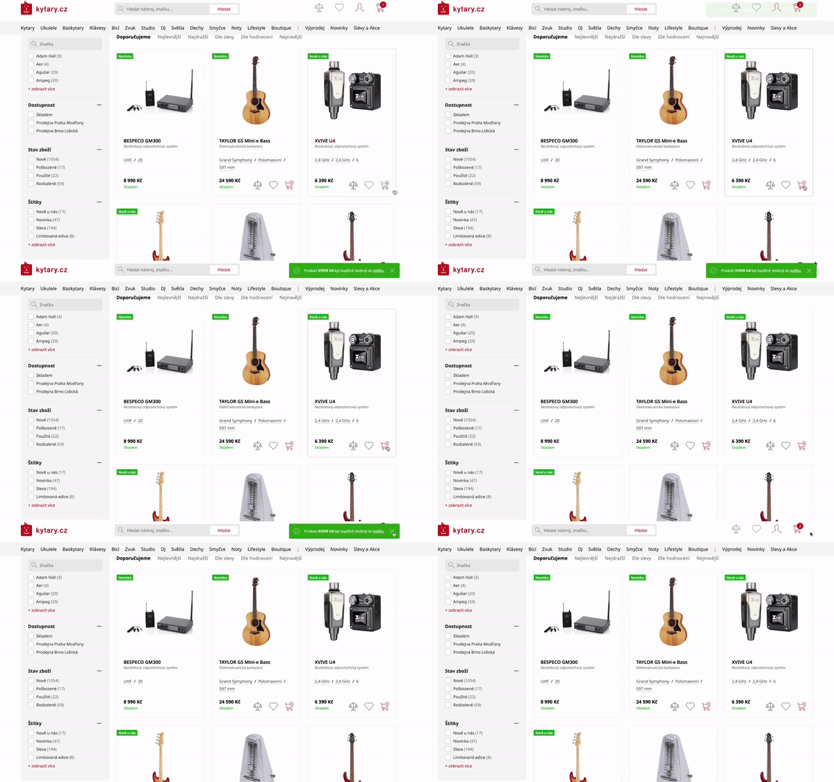
Initially, when an item was added to the cart, a confirmation toast appeared on the screen (Before). However, due to the very low contrast ratio between the text (white) and the background (green), users could barely read the message. As a result, users were often unsure if the item had been added to the cart and kept adding the same product repeatedly.
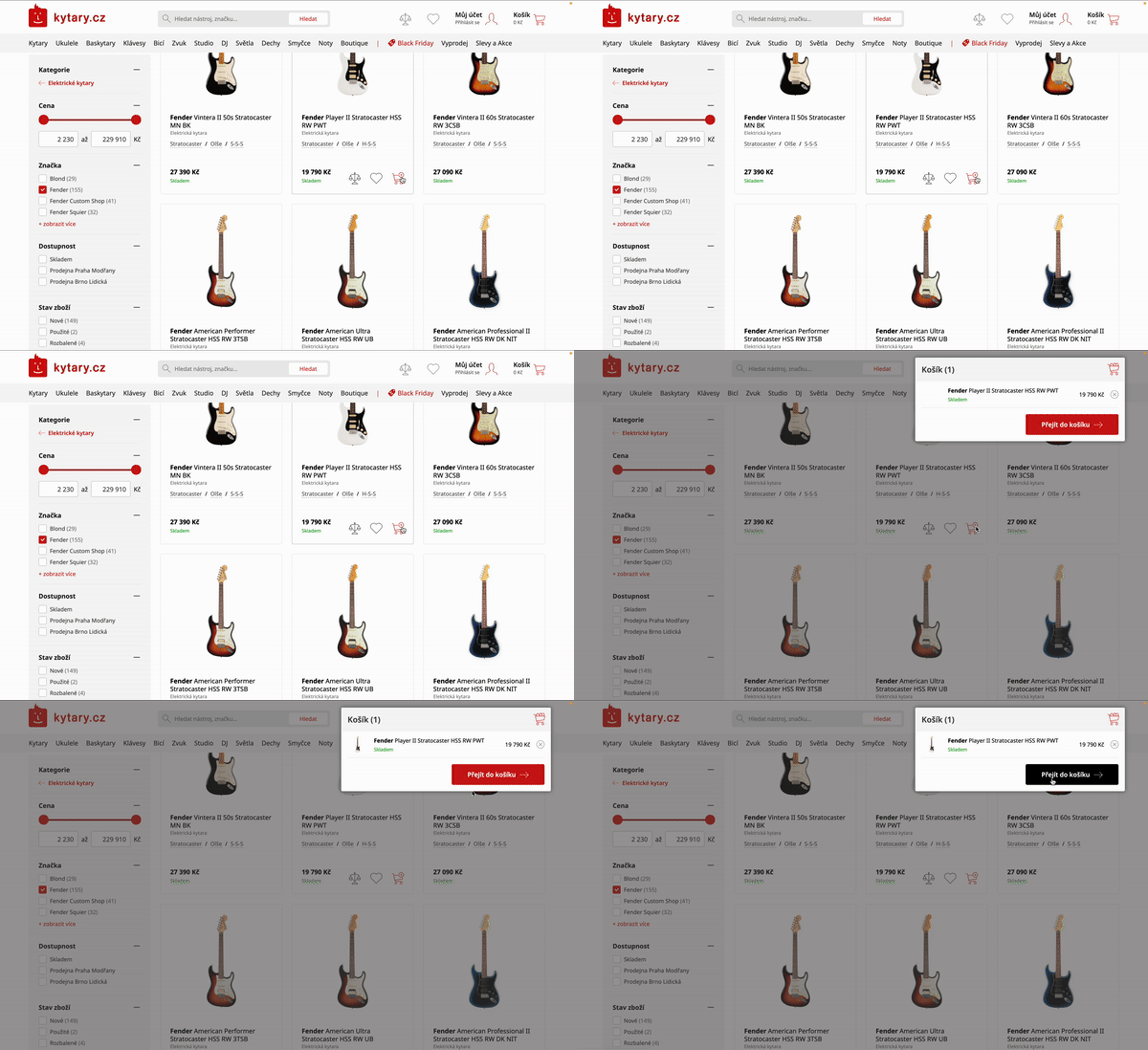
Instead of the confirmation toast, I suggested implementing a mini cart pop-up with a "Proceed to Cart" button (After) for both desktop and mobile. This way, users can be sure the item was added and can proceed to the cart without reopening the modal again.
Before

After

Improving Mini Cart Interaction:
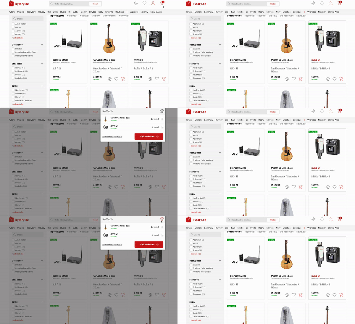
Previously, the hover delay for the mini cart modal was too short, causing it to close immediately when users accidentally moved the cursor away (Before). As a result, users often had to reopen the mini cart modal multiple times (3 or 4 times)
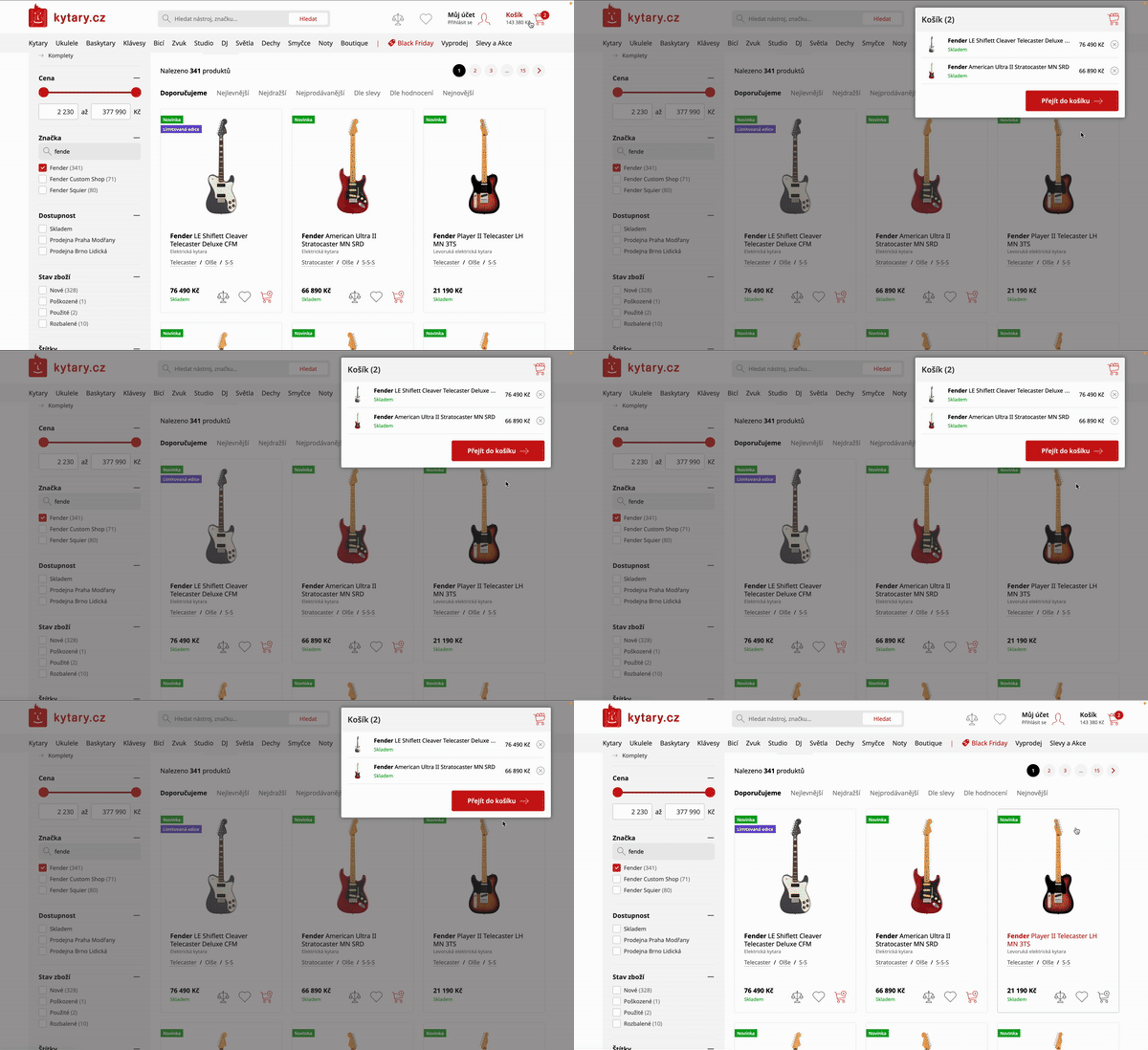
I set the hover-in time to 200 ms and the hover-out time to 400 ms (After) to prevent accidental dismissals. Now, if users accidentally move the cursor out of the modal zone, they have enough time to move it back before it closes.
Before

After

Cart Layout Redesign
When users navigated to the cart page, they failed to realize they were in the cart, because the "Proceed to Checkout" button was located at the bottom of the page (Before). The confusion led to users repeatedly trying to access the cart.
The explanation for this was simple: the design violated Jakob's Law of UX. According to Jakob's Law, users develop strong expectations based on their previous interactions with other websites. When users encounter a cart with the checkout button placed at the bottom, it disrupts their mental model and creates confusion, as they cannot see the button in the viewport immediately.
I've decided to repositioned the "Proceed to Checkout" button near the top-right corner of the cart page (After) as a floating action button (FAB) that remains visible while users scroll to a certain point. And changed the overall layout design of products in cart, making it more compact. This ensured that both the products and the summary are visible within the viewport, improving the overall usability and user experience.


- Mobile Cart Issues:
Users struggled to find the "Proceed to next step" button, which was buried beneath products, cross-selling offers, the "More products" button, and "Continue shopping" button (Before).
While this placement aimed to encourage cross-selling, it failed because users focused solely on locating the CTA, ignoring "Don't forget to buy" items. - Relocated the "Proceed to the next step" button to the top for immediate visibility.
- Redesigned the cross-selling section as a carousel to save space and positioned it below the "Proceed to the next step" button.
- Removed the "Continue shopping" button, which was unnecessary and added clutter.
- Redesigned the product boxes to occupy less space.
- Enhanced the summary section design, made it more prominent, and moved it to the top for better visibility.
Implemented Changes:
User Testing
To ensure the redesigned cart effectively addressed the identified pain points, I conducted a series of usability tests with real users. These sessions aimed to validate the changes, gather qualitative insights, and identify any remaining friction in the cart experience.
I used the same scenarios from the initial testing but focused more on the purchasing process. The tests were conducted with new participants to observe whether there were any changes in user behavior.
Based on user feedback, I made small adjustments to certain areas of the cart experience. For example, I added tooltips to clarify additional services in the cart that were not clear enough, and I also included a "Price includes VAT" tag for better transparency.
Additionally, we introduced new features to enhance the cart experience, such as a one-click "Express Checkout" option, allowing users to quickly complete their purchase with saved payment and shipping information, reducing friction and speeding up the process. We also improved the relevance of cross-selling items by using smarter algorithms that recommended complementary products based on the user's browsing and purchase history, resulting in more personalized and effective suggestions.
Outcomes
The optimization of the cart experience led to significant improvements in both user satisfaction and business metrics.
Within the first month after implementation, we saw a measurable impact on the user journey. Users constantly left positive feedback after completing their purchases, highlighting "Clear navigation", "Ease of use", "Website clarity", and "Fast checkout process".
After a 3-month monitoring period, we observed a significant increase in mobile purchase rates. Not only did more users begin shopping via mobile, but the number of users purchasing from mobile devices actually surpassed those buying through desktop.
- Mobile Purchase Growth
- + 20%
- Conversion Rate Increase
- + 18%
- Drop-Off Rate Reduction
- - 22%